Clip Art

|

|

|
Objective: Using drawing tools, I had to create recognizable images with simple geometric shapes as the start/basis.
Direction: I chose these images because I thought they were very recognizable in modern media. I chose to draw a raggedy Ann, an eye, the Goblet of Fire, a Spider-man logo, an angel with a devil, and a Kirby. Likes: I like how the angel and devil turned out as their wings are very prominent. Dislikes: I don't like how the goblet and spider legs had smeared ink. |
Olympic Symbol

Objective: An image using geometric shapes had to be created to represent an Olympic sporting event from either the summer or winter games.
Direction: I chose to base my image on Olympic sailing because as a child I would always watch Disney's Pirates of the Caribbean movies, which take place on the water.
Likes: I like how I let the water in the image extend outside the box, giving it a grander look/perspective.
Dislikes: I don't like how I made all the strokes a black color when the lines of the waves could be a shade of blue.
Low Poly Geometric Portrait

Objective: I had to create an accurate representation of my face by tracing over an image of it with geometric shapes (mostly triangles), and then filling them in with color (eye dropper tool).
Direction: I chose this image of my face to replicate because it was a simple smile that shows my face and could easily be made to look 3-D.
Likes: I like how the forehead has such a variety of colors, showing off the different lighting, that it looks very 3-dimensional.
Dislikes: The nose, it's nostrils, and the cheeks appear to blend in with one another so there isn't greatly defined space to differentiate the features.
Monogram

Objective: To create an image important to me that is made out of my name's initials.
Direction: The meaning behind my image represents goal setting. The cave is supposed to resemble being stuck in life, not knowing where to go. But the river represents pursuing opportunities and dreams that could lead to a better future. The T in my name is the sign, the K is the cave, and the J is the waterfall that leads into the river.
Likes: I like how the sign has a 3-D effect giving the image some depth.
Dislikes: Overall it seems pretty simplistic, it could have used some more detail.
Maze

|

|
Objective: Use adobe illustrator's pen tool to create a kid friendly maze. Direction: I chose to use Mulan and Cri-Kee from the Disney movie Mulan. I always liked this movie as a kid, so I figured the designs were appropriate for children. Likes: I like how my characters turned out, they look very accurate from the film. Dislikes: I don't like how simplistic the background is. I could have done more with it, like a gradient or more designs from the movie to use as obstacles. |
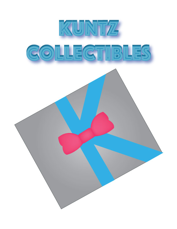
Logo
|
|
Objective: Create a company and design it's logo using adobe illustrator.
Direction: I had the idea of my company being one that sells old toys to teach the public about America's past and the history of POP culture. Like: I like how the K fits into the design, it looks like a way you could actually wrap a box. Dislike: The text design doesn't really fit my idea for the company. |
Hand Cut One Color Screen Print

|

|
Objective: Produce five high quality, one color screen prints on paper, using a self-selected image.
Direction: I chose to screen print Davy Jones from Pirates of the Caribbean because his design is very interesting to me, and I thought it would be challenging. Like: I like how my image gives off a menacing presence, and I like the level of detail that went into my print. Dislike: The lines on the top and bottom of my print to separate the image and the edges of the paper are not straight. |

Textile One Color Screen Print
|
Objective: Use the Photo Indirect Method to create an image to print on a t-shirt or other textile. Direction: I chose to design my shirt's screen print on Catwoman from Batman Returns. I thought the character design itself was a very interesting look, so I wanted to do a shirt on her and give it away as a present to my Mother (as she always enjoyed the character). Like: I like how my shirt's design didn't give Catwoman pupils. It really gives off an interesting, fierce appearance, allowing her face to still look complete. Dislike: The image is lacking major detail and while I attempted to make the smoke bring off a definitive and cool presence, it could be viewed as a distracting blob. |


Offset Print Notepad

|

|
Objective: Create a stack of printed images using the offset printing press, glue them together, and cut them to form usable notepads.
Direction: I wanted to create a present for my mom and market her business in a way. Like: I like how the piano when it is image traced, gives off a shiny look and an overall formal appearance. Dislike: I spelled assignments wrong, however it could be viewed as as"sing"ments, which fits the theme. |
Event Poster

|
Objective: Design a digital poster to grab the audiences attention so they would attend the event that I am promoting.
Direction: I chose to base my poster on a Pirates of the Caribbean Movie Marathon Event. Those films are some of my favorites, and I thought it would be interesting to try and emulate the franchise's style into my own poster. Like: I like how I incorporated the famous visual aspects from the Pirates of the Caribbean franchise in my poster. The skull looks very accurate to the ride and Films. The Banner with the title as well looks really good, as people would recognize that that is the way that the Pirates of the Caribbean movie titles are placed in their respective posters. Dislike: The background is pretty bland. The only interesting part is the water, which is still lacking major detail. |
Tutorial 1: Adobe Illustrator Kitchen

https://design.tutsplus.com/tutorials/how-to-create-an-illustration-of-a-retro-kitchen-in-adobe-illustrator--cms-29655
Tutorial 2: Finn From Star Wars

https://design.tutsplus.com/tutorials/how-to-create-cute-star-wars-characters--cms-29701
